Napa
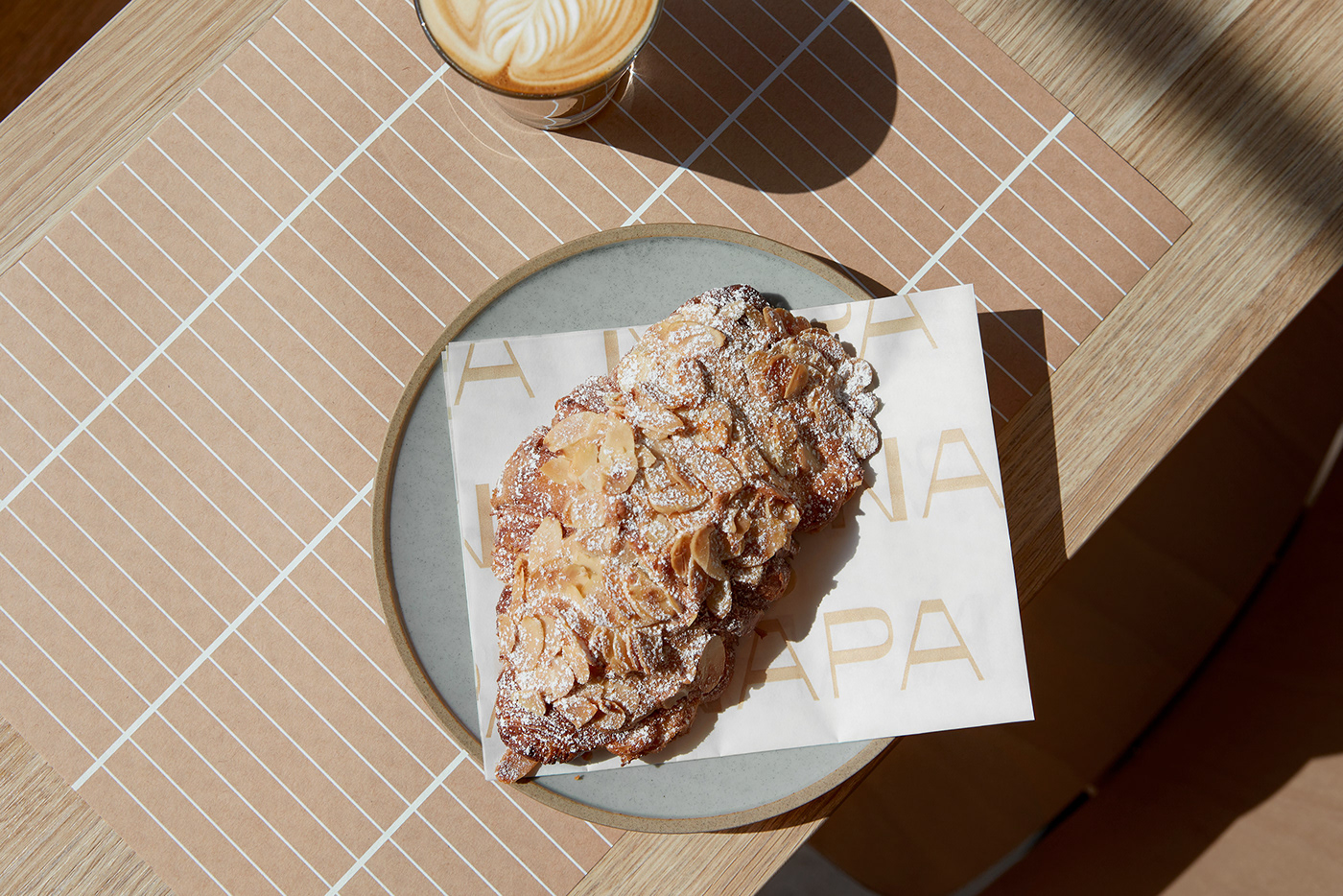
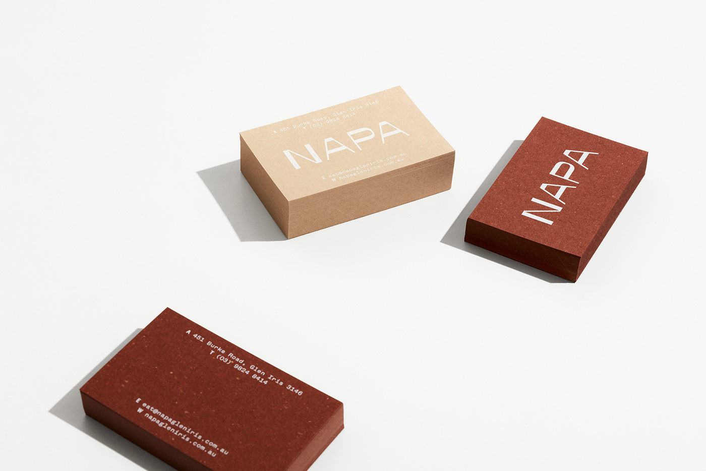
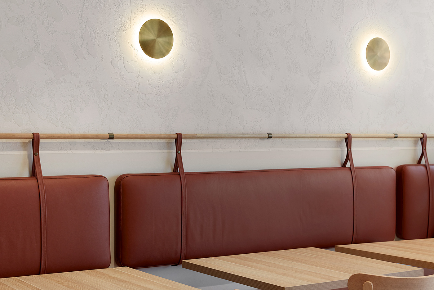
We were engaged to create an identity for Napa, a new eatery positioned in a bustling part of Glen Iris. Steering away from any obvious visual tropes associated with the venture's namesake, the Napa Valley in California, we instead focussed on the experiential qualities of the region; the sense of space, the rich soils and the wide open blue skies. The resulting design revolves around an understated and uncluttered visual language, underpinned by a textural palette to reflect the warmth and relaxed pace of the Napa Valley.
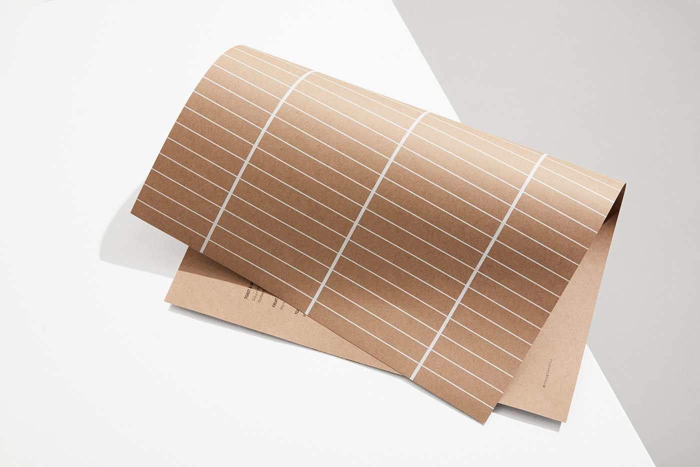
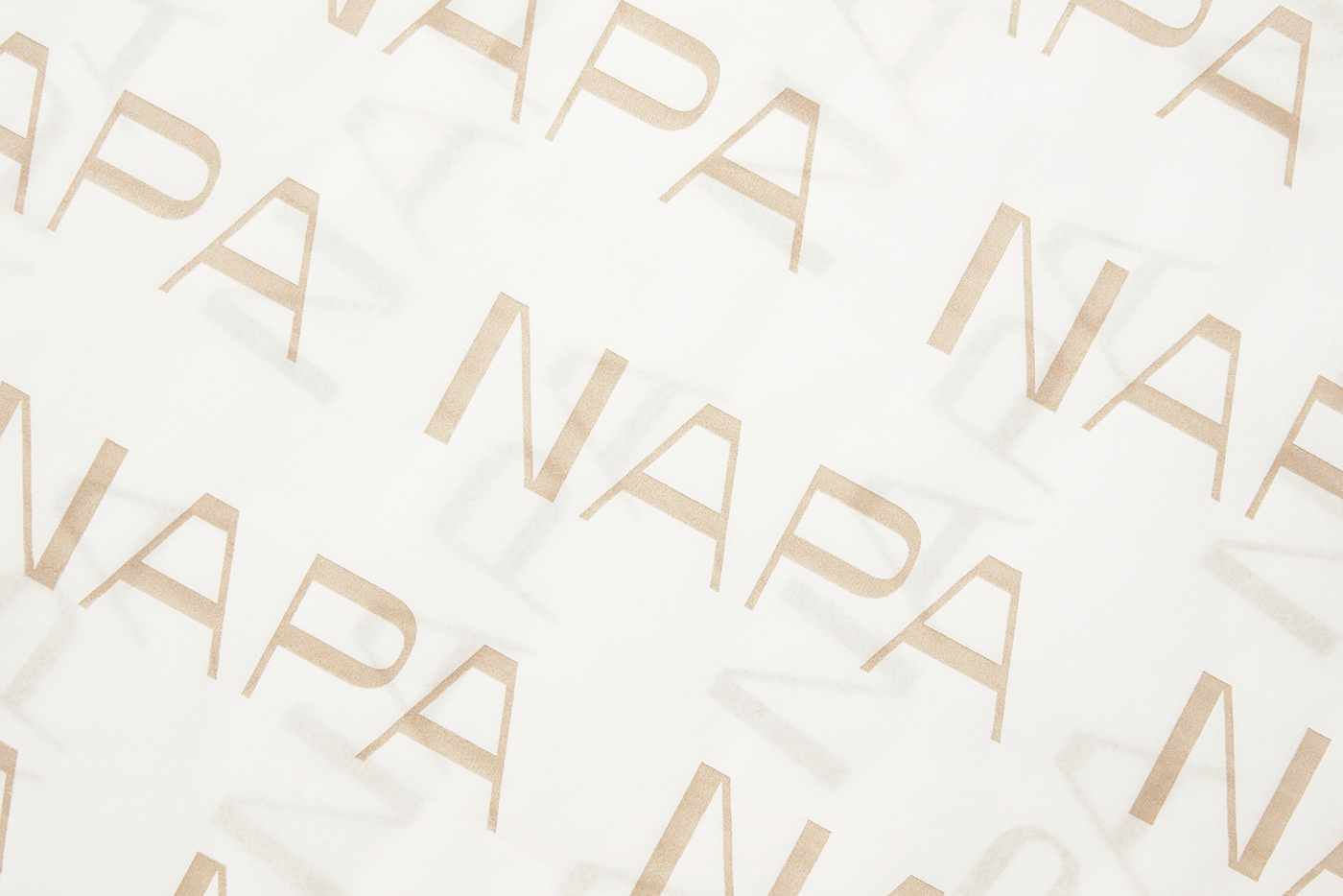
Working closely alongside the team to ensure a thoughtful meshing of the interior and identity concepts, we created a pattern referencing the tiling within the space, brought to life by the characteristic dual line weights within the logotype.
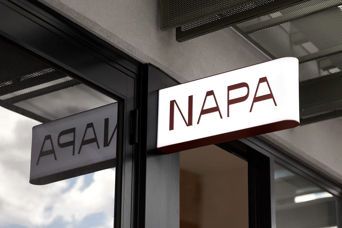
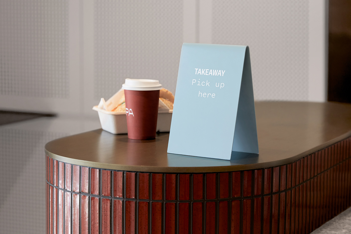
The introduction of a pale blue highlight colour visually separates the takeaway offering from the rest of the space, allowing patrons to navigate the space somewhat instinctively. The signage features subtle curves to reflect the shapes used within the interior, fabricated from powder coated metal—a smooth counterpoint to the many textures used within the space.
Working closely alongside the team to ensure a thoughtful meshing of the interior and identity concepts, we created a pattern referencing the tiling within the space, brought to life by the characteristic dual line weights within the logotype.
The introduction of a pale blue highlight colour visually separates the takeaway offering from the rest of the space, allowing patrons to navigate the space somewhat instinctively. The signage features subtle curves to reflect the shapes used within the interior, fabricated from powder coated metal—a smooth counterpoint to the many textures used within the space.
Photography by Shelley Horan